Abstraction: Tone
I’ve designed myself a ten step programme to move from Representational art into a personal language of Abstraction. To understand what I mean by that, be sure to read my blog A Language of Abstraction.
This is step five: TONE
A few years ago I read a book called "The Van Gogh Blues: The Creative Person's Path Through Depression" by Eric Maisel Phd. It's not essentially a book about Van Gogh, but rather grapples with the notion why so many creative people suffer from mental health issues and what we can do about it.
Through years of experience as a therapist, Maisel proposes that creative people will experience periods of depression when, through circumstances, their work loses its meaning. These "crises of meaning" are inevitable because creatives are regularly confronted by doubts about the meaningfulness of their efforts.
This rang true for me. When I look back to my most severe periods of depression, it has been as a direct result of my ruminating over the question "what is the point of doing this?" and my mind has spiralled to a deep dark place of: "there is no point" until finally - because so much of my identity is wrapped up in my art making - I land on the darkest place of all: "therefore, there is no point of me."
To some, this line of thinking seems overly dramatic, but a "pull yourself together" mindset does not cut through the crippling sense of pointlessness.
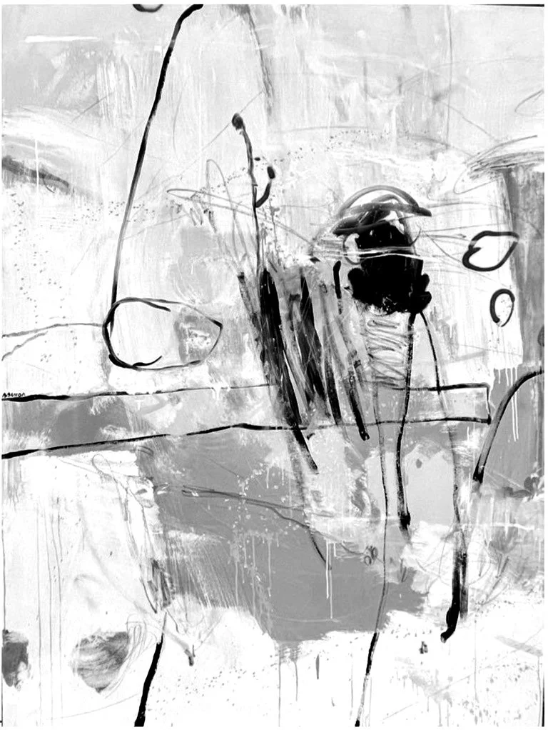
This, to me, is pure black.
It is a hopelessness that is crippling.
I feel fortunate that I haven't experienced this dense blackness for several years, but it often feels within vulnerable reach.
The Abstract Expressionists had a special relationship with black. Their Impressionist predecessors were opposed to the use of black in a painting because they were dedicated to painting light: how light refracts into colour. Black does not exist in this context.
As the Abstract Expressionists were concerned with painting emotion, black very much exists in this context.
Black is at the extreme end of the value scale.
Working with contrasts (in the previous step) puts me in a good mind-set to think about tonal value.
It’s an element I have continually struggled with, yet it’s fairly easy to fix. It is often overlooked by beginner artists, but once mastered, radically elevates a painting’s success. [In art school we were told to look at our subject through squinty eyes to see the variations, which works rather well.]
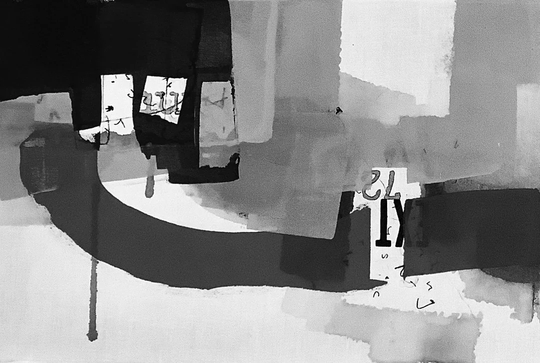
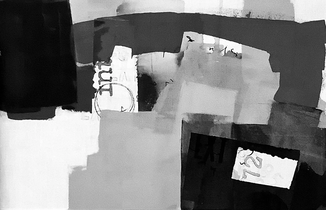
Looking at these examples by some of my favourite artists, it’s easy to see the variation in tonal value in the black and white image; it’s a little trickier when working with colour. I’ll be exploring tonal value in colour in step six. However, for now, I’m identifying a light, mid, and dark tone.


Tonal variation can be created with colour, but also with density. In my single-line doodles I only used line, so I could create the illusion of tonal variation by having some areas loose in contrast with some more densely drawn areas. As with this doodle of Budapest’s stunning Parliament building.
The same effect can be made using a variation in line thickness or pressure. I played with this idea when working on gesture.
I found these studies that I did a while ago which illustrate a simple light, medium and dark tonal value. The originals are in pink, but I’ve removed the colour saturation to show the tonal values. They are painted with acrylic on white cotton; the paint was spread across the stretched cotton using a rubber wedge for quick mark-making. This is a very effective way of getting several ideas down quickly.
These kind of studies can then be used as a road-map for a painting.


I’m liking the compositions in these (which I think was the original purpose for the studies). When thinking about value, composition is always at the back of my mind. I’ll be taking a closer look at composition in step seven, but for this study I’m looking at ways to create a range in value, both in sketches and in paintings.
As this is an element I struggle most with, I’m giving myself a helping hand with the materials I’m using. The screenprinting mesh I’m painting on allows for very soft washes of colour; it will also take thicker opaque paint.
By first applying a gesso or ground to the mesh, I can further control the tonal value and the opacity of the paint. Applying the paint on the reverse also reduces the value of the colour. I’ve used both white and clear acrylic gesso and watercolour ground in these studies.


I’m beginning to see tonal variation as part of the second response to inspiration. (The first being shapes.)
So much can be said with very few marks; a complete scene can be captured. With this in mind, I set about making some urban sketches using this idea.
I’ve documented my struggle with urban sketching a lot on this blog; it’s something that I know I should be able to do and should be doing often, but, oh boy, it gives me anxiety! Over a number of sessions I have found a way to make it work for me by throwing out my notions of the fantasy sketchbook (google “urban sketching” and you’ll see what I mean) and by pinning down what information I really need to gather from the street in order to create a successful painting back in my studio.
I’ll write another blog on this subject of useful sketching another time, but I’m beginning to see that it all comes down to the questions I ask myself at the moment of inspiration: What has caught my eye? and How do I feel?
As tonal value can be expressed through colour value or the density of mark-making, I can answer those two questions with simple sketches using a graphite block and sticks.


The materials don’t allow for detailed drawing (which instantly takes the pressure off me) and the soft graphite chubby is so delicious to work with.
This sets the scene to then make some more detailed sketches (represented by the darker areas). In these studies, the light and dark is captured; a little smudging of the graphite or a grey brush pen gives some mid notes.
I’ll be exploring more ways to create little studies like this when I look at creating a strong composition.
Next up: Step six is exploring how I can translate grey scale into COLOUR