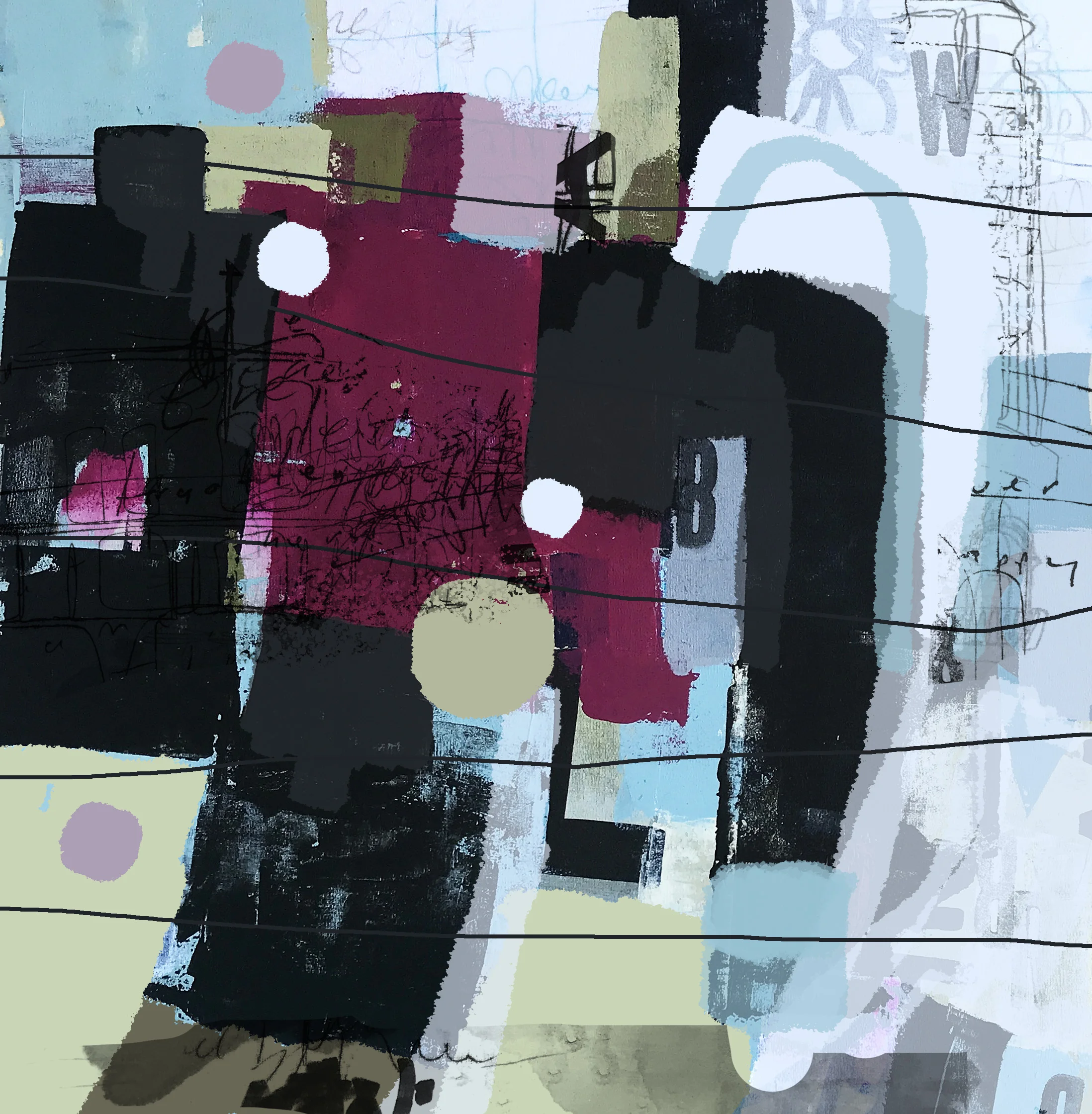
The Meaning of Black
A couple of years ago, I saw the most incredible exhibition at the Royal Academy of Art in London of the Abstract Expressionists. I spent hours in there! I felt both inspired and emotionally connected to their work and process. One section caught my attention in particular explaining how the Abstract Expressionist painters used black in their art.
It may not sound controversial, but in the art world, the use of black is a divisive issue! Black as a colour doesn’t occur naturally, so landscape and portrait artists tend not to use it, but choose instead to mix a colour with purple or blue to create the fractured light. Using black is considered lazy. There is quite a stigma attached. In fact, I went to buy a tube of black acrylic on my most recent visit to an art store in Brisbane and as I consulted the knowledgable sales assistant on the best brand to buy, he remarked, “but you’re not going to be using a lot of this are you!” It wasn’t a question. I felt obliged to shrug and utter weakly, “depends…”
With the birth of modern art, however, artists became more influenced by culture and unseen things rather than reality. So black became a statement. Each Abstract Expressionist artist had their own justification: a connection to the coal industry, war, anarchy and mental health. A theme emerged of each artist finding a balance between chaos and control. As I immersed myself in these incredible works, I posed myself a question in my notebook that has since sat unanswered: what does black represent in my art?
This week on the Free Up Your Art course [by Tara Leaver], I’ve been working on “Tidy and Wild” mark making. She’s encouraging us to always think about using contrast in our work: light and shade, quiet and busy, delicate and energetic lines, smooth and textured surfaces etc etc.
Although I had fun using a variety of materials, I still found the discipline of restraint rather challenging.
It’s the story I hear time and time again in creative work; contrast is our secret weapon, the most powerful tool in our arsenal. It’s something I know, but have yet to master.
I had an inkling at the start of my artist journey that this was a huge problem for me and if I face it head on, I’ll make a breakthrough in my work.
I’ve always associated contrast with opposites and opposites with conflict and I’ve always shunned outright conflict, both in my everyday life and in my choice of escapism. I’ve never been a fan of the clearcut hero/villain drama, (like James Bond or superheroes) but prefer the grey area of an internal war. [Which I suspect is one of the reasons I floundered as a screenwriter, given that conflict is the essence of all storytelling.]
I am, however, acquainted with “struggle”. I understand the impeding agony of the counter argument. I live daily with a constant battle between one thing and another. If I’m going to embrace contrasts [and conflict] in my work, then I should refer to and assign these tensions as I create.
Tensions between spontaneous, intuitive, joy of mark making and creating something thoughtful and meaningful; Painting something beautiful [sellable] and honest [possibly ugly]; a battle between noise, stimulation and stillness and calm; my imaginative life and my real life; faith and reason, home and exploration, between solitude and community… and then there’s the biggest tension of all: mental clarity and mental ill-health.
These tensions accompanied by other chatter and music are constantly fighting each other for my attention. This is my conflict. This is my black.
I often refer to this illustration by Sylvie Reuter which expresses how depression feels so perfectly. I have joked that I should have these images printed on a series of t-shirts and wear whichever one is relevant so my husband can see immediately how I feel without having to ask. [Note to self: I really should do that]. I find it particularly striking that the black figure is present in every illustration in the sequence; sometimes he’s small, hardly noticeable and definitely not interfering, but he’s there.
This is a valuable concept to bear in mind as I work. It will determine how much black I use in any given piece. As you are reading this, my use of black will be like a secret message to you. You will know how I’m feeling without having to ask. I won’t need to get those t-shirts printed after all.
